Steam Discovery Redesign
January - March 2026
My Role
Product Designer: User Research, Interaction Design, UX/UI Design
Result
Passion Project, Conceptual
Timeline
3 Months
Introduction
Steam, created by Valve, is home to millions of players, creators, and communities. And with thousands of games and platform features, Steam succeeds when players can discover, connect, and play without friction.
With a growing library and an expanding store, discovery has become harder than it should be. For players trying to find their next game, and for the independent developers trying to reach them.
This redesign focused on one thing: making it easier to find games.
Preview
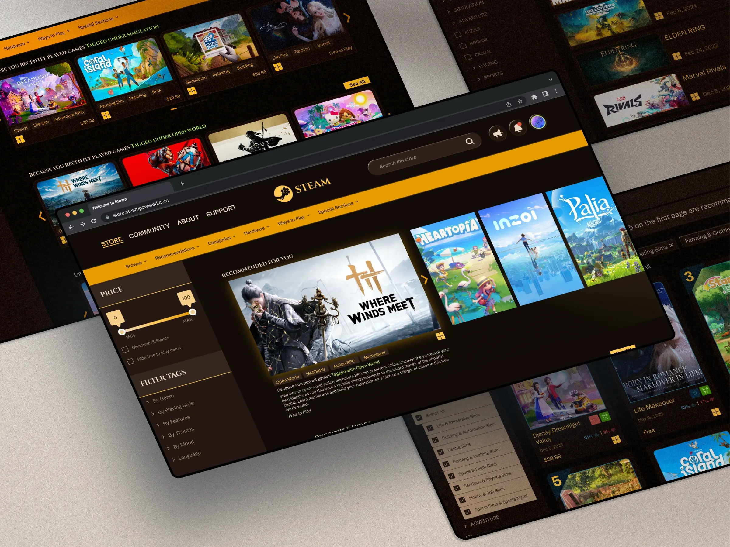
Refreshed shop tiles & carousels
Reduced carousel & tile variety to prevent information overload, and standardized tile layout with tags visible at a glance.
store home experience enhanced
Less cognitive overload. Clearer access points.
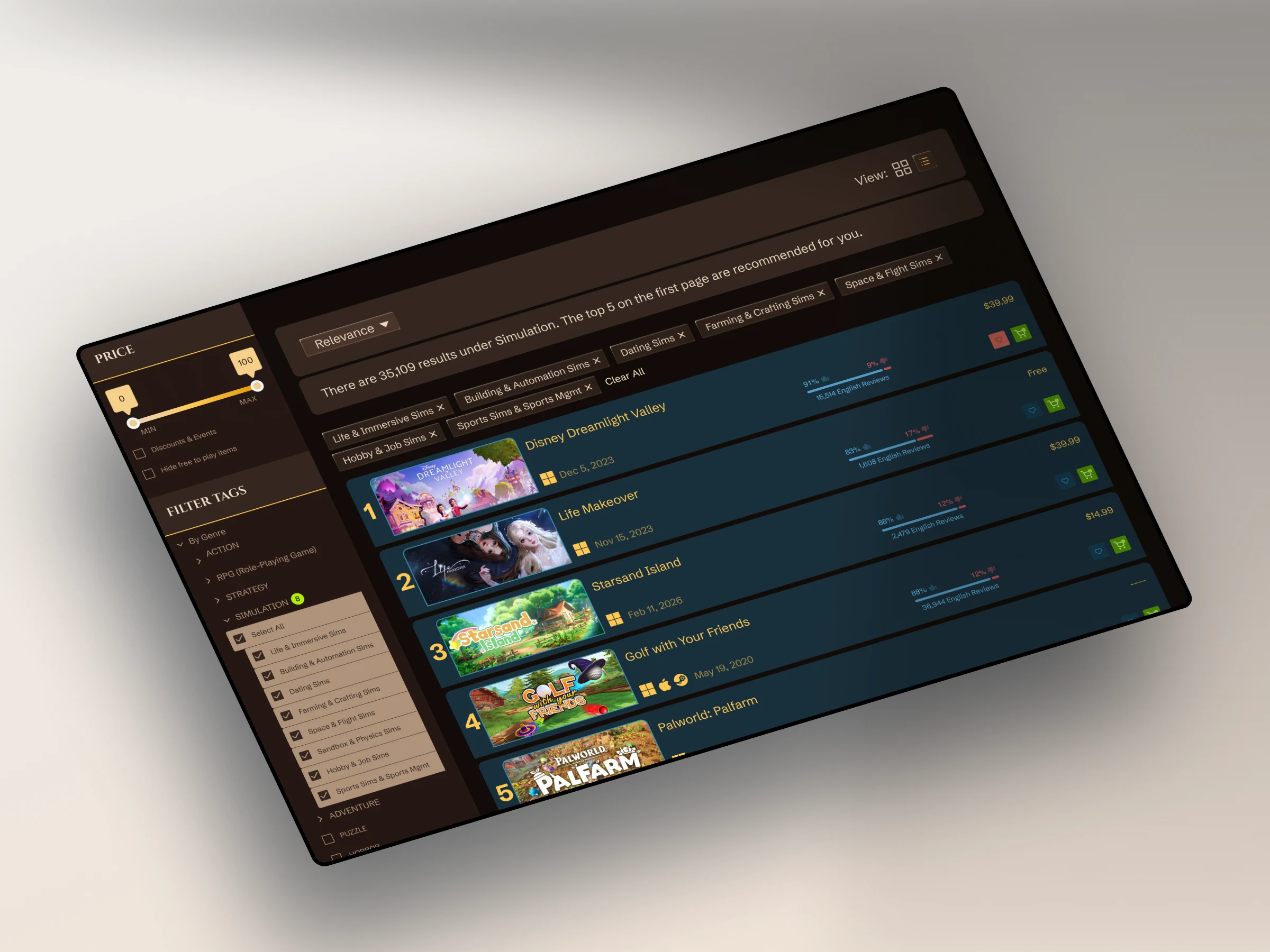
List & Grid view options
Two views, one click built to suit all users.
sectional recommendations
Top 5 game Recommendations in a section for you under See All pages.
Context
purpose of steam
Valve built Steam on the main idea of having a direct relationship between creators and their players. With thousands of games across every genre, Steam works best when discovery works.
When it doesn't, players may stop exploring. Developers may stop being found.
This redesign is about strengthening that connection.
The Problem
Discovery is Broken
Steam makes it harder to find games than it should be.
To understand where and why, I reviewed user thoughts on media platforms like reddit and surveyed ~40 users (Ages 18-34). Mostly expert-level players with 5+ years on the platform. These aren't new users getting lost on their first visit, they know Steam. And they still hit walls.

Design Process
01
USER RESEARCH - SURVEY Analysis
A/B Test: List vs. Grid View
57% preferred a list view, 43% preferred a grid.
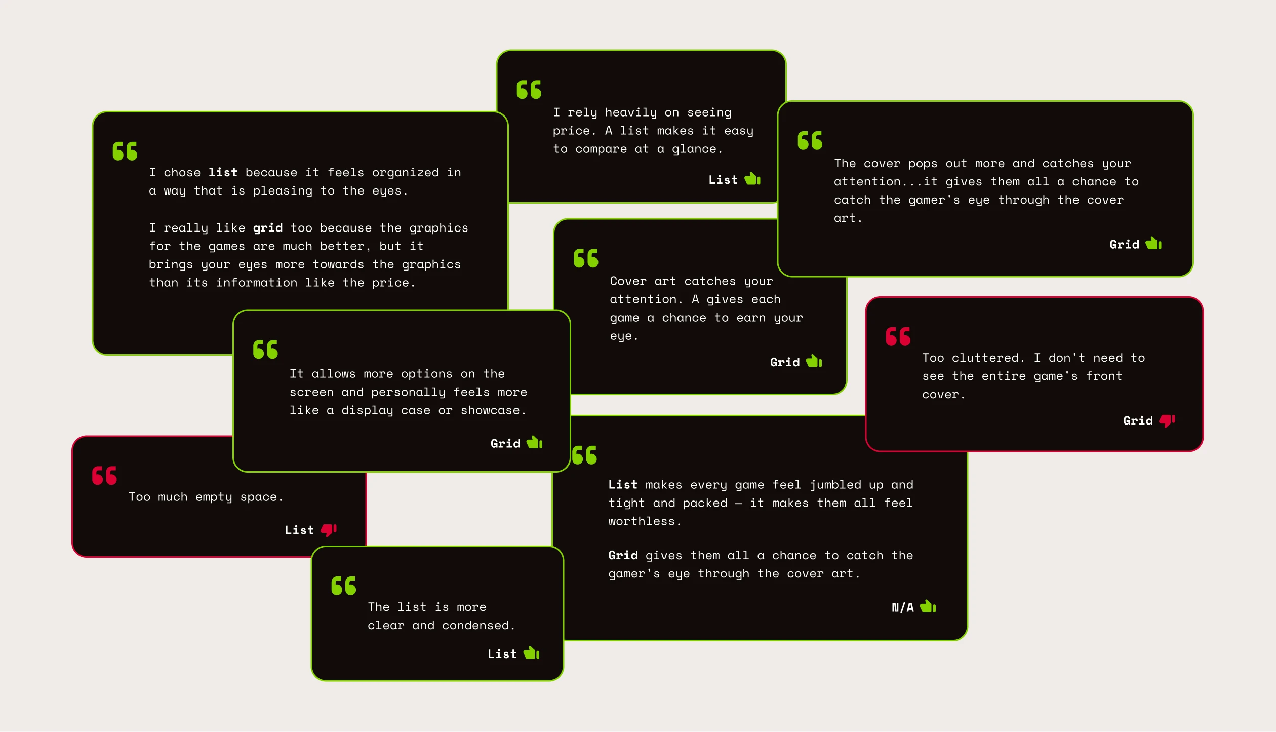
That's not a small preference gap. That's two different ways people discover games.
02
Competitive Analysis
Many responders mentioned various platforms and what they liked/disliked, but the ones about Epic Games and Nintendo eShop stood out the most.
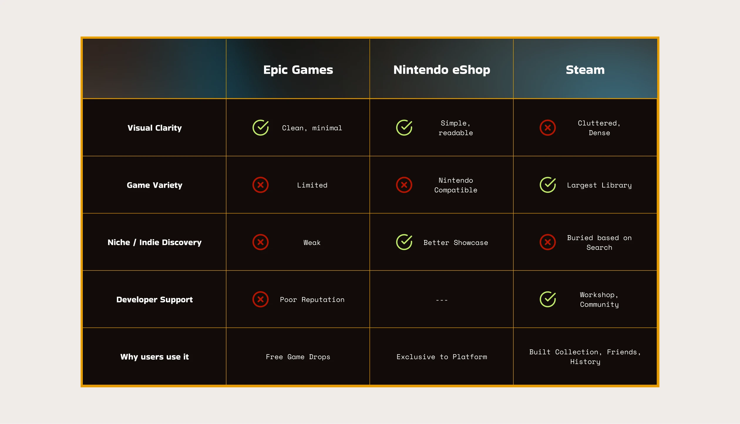
Epic Games and the Nintendo eShop felt simpler, cleaner, easier to understand on first visit. But they still chose Steam. Not because it was better to use, but because of game variety, years of library investment, and where their friends were.
03
Ideation
Store Home Layout Design
The redesign of the store home was done to simplify competing sections and create clearer entry points for users.

Shop Tiles
Steam's store home had around 10 different tile designs alone.
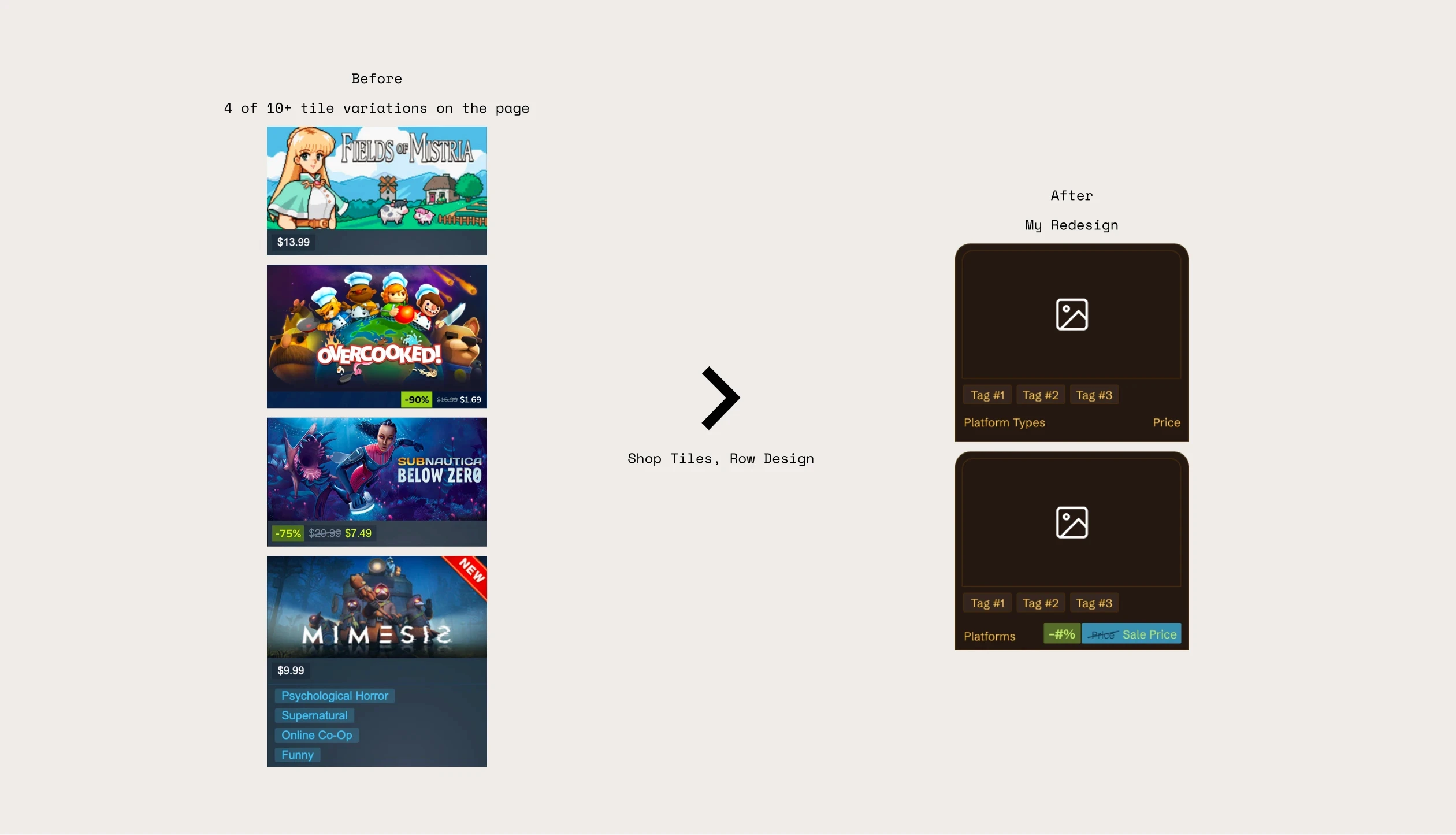
The redesign meant to be scannable, just enough information to make a decision without adding to the noise.
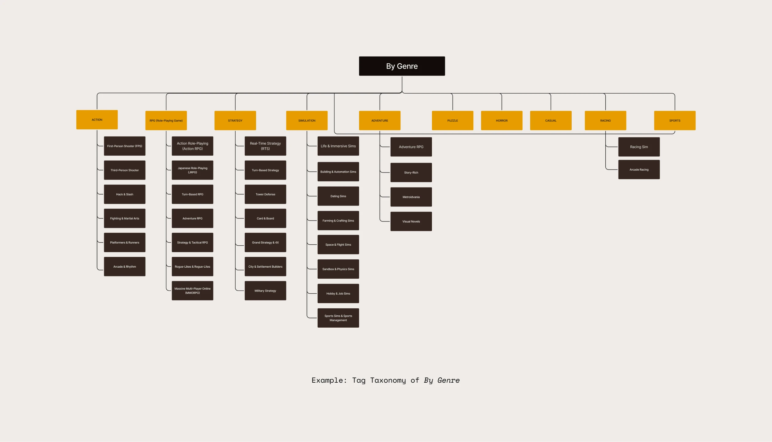
Tag Taxonomy of by genre
Steam's tags struggled a bit to help users find specific games. So I gave them depth.
Expanded view when clicking see all
People on reddit have pointed out that certain pages they land on felt like it was a new website (example below).
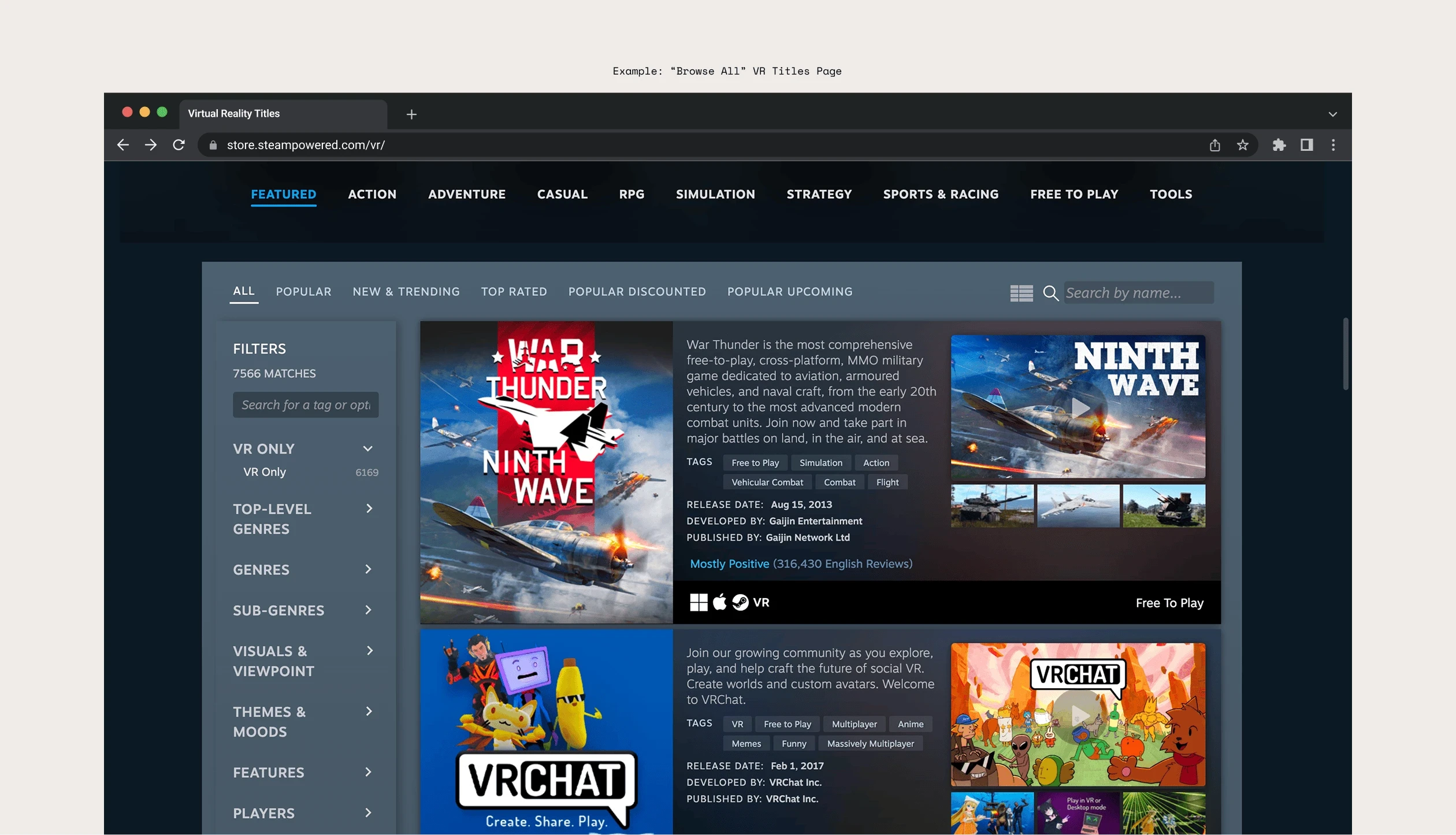
I intend to have a bit more personalization when exploring See All, it will have top 5 recommended games at the top.
Final Designs
brand new tag system
Accessible everywhere, simplified into 6 categories.
See all under one experience
When you click to see more, you now get the same experience everywhere plus some personalization.

In Retrospect
01
Scope is a design decision
I originally planned to redesign Steam's Library as well but doing one thing well is more honest than doing five things halfway and that is exactly how Valve builds too.
02
Understanding Design in a system
Steam serves two sides at once, players and the creators trying to reach them. Every decision I made had to respect both. Changing one thing meant understanding why it existed in the first place.
03
minor details can be impactful
Valve describes Steam as a place for creators to establish direct relationships with their customers. That relationship starts with discovery. This redesign was about making sure nothing got in the way of that.